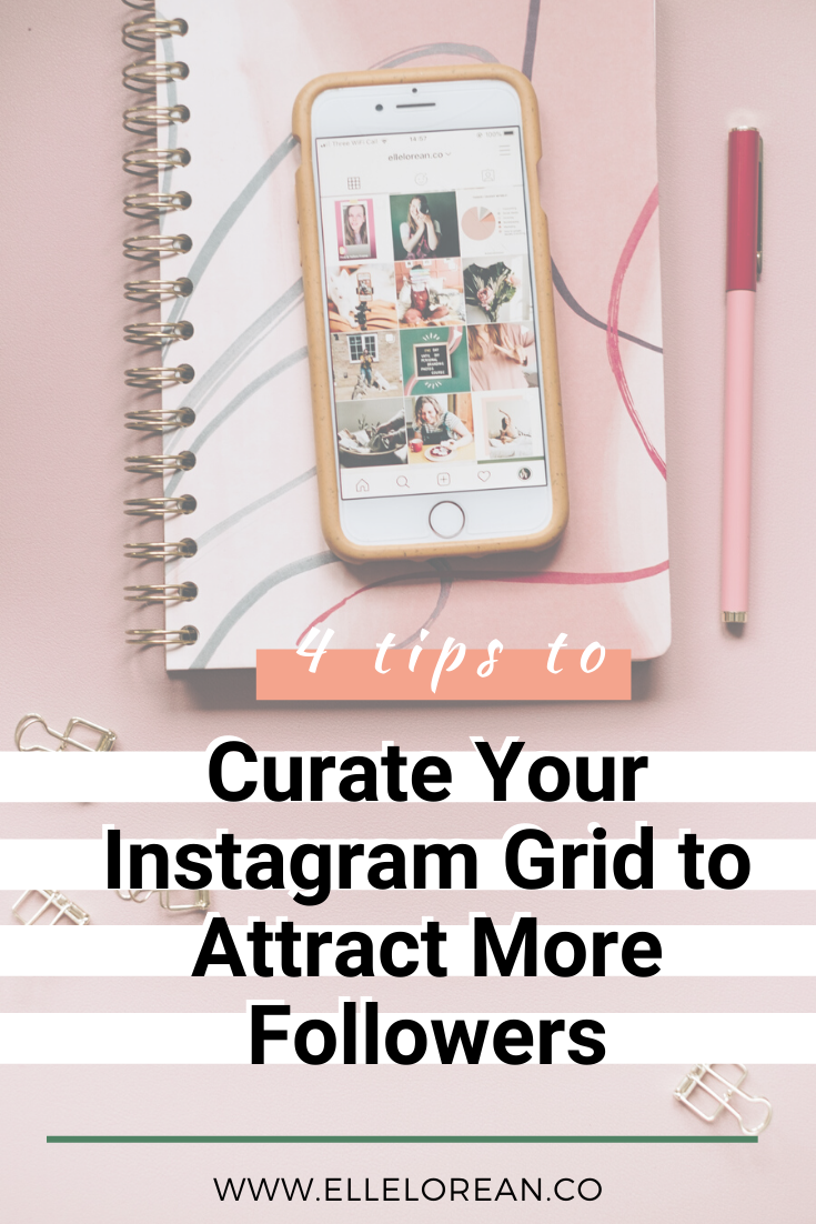
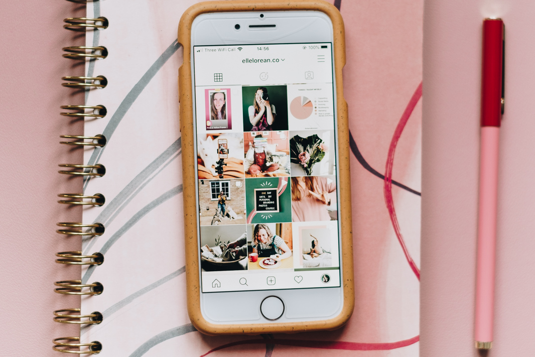
Your Instagram grid is the thing that people look at when making that split second decision about whether to follow you or not. They look at your posts as a whole and decide if they want to add yours to their feed. It’s not for everyone to curate their feed, nor do I follow this all of the time. This post is mostly for people who WANT to curate their grids and guidelines or ideas to think about during that curation process.
You can use these 4 tips to curate your Instagram grid to attract more followers and get more of your posts seen on their feeds.
Curate (verb) :
- select, organise, and look after the items in (a collection or exhibition).
- select, organise, and present (online content, merchandise, information, etc.), typically using professional or expert knowledge.
1. Develop in Blocks of 9

When you develop your images in blocks of 9 it is easier to gauge the overall mood, feel, and direction of the images. You begin to create a fuller story. We shouldn’t aim to tell a whole story in one image. You are a multi-faceted person running a multi-faceted business. Take a step back from everything and look at how you can piece things together to create a balanced story.
2. Space out Bold Colours

Spread your brand colours out on your grid to create a bit of symmetry and balance. It doesn’t have to be perfect, but peppering your colours across your feed gives it a cohesive and consistent feel.
You’ll see a lot of brands that are graphic or text heavy follow this as well. For example, look at GrowGlow’s instagram feed:

They’ve taken their brand colours and spaced them out in their top 9. Purple isn’t directly next to purple, orange isn’t directly next to orange. The eye loves this sort of colour balance.
3. Space out Light & Dark Photos

I don’t use many dark photos on my grid, but when I do they are not placed next to each other. You might notice this idea of SPACE continuously cropping up. Don’t place like next to like. Switch it up, space it out, allow your grid to breathe.
4. Space out Image Types

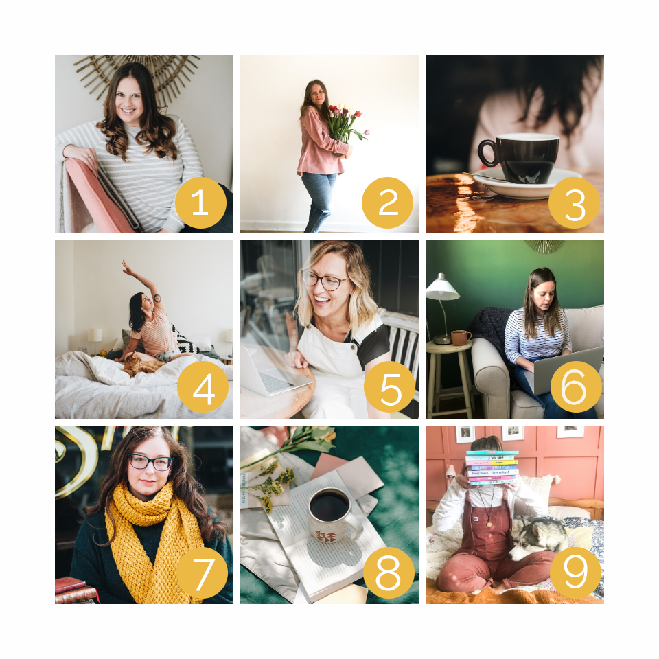
I try to keep in mind the 6 different image types when I’m curating my Instagram Feed. These are:
- Wide Shots (2 & 4)
- Medium Shots (6 & 9)
- Close up Shots (1, 5, & 7)
- Looking Down (8)
- Looking Up
- Details (3)
In this sample grid, I don’t have any Looking Up images, but that’s okay. Again, the idea is to pepper the different types throughout your grid to create space, symmetry, and balance.
You don’t have to follow these tips strictly, but starting to incorporate them into your feed might just be the reason someone pauses for a moment on your profile and then clicks that Follow button.


0 Comments